Sunday, December 11, 2011

The Color/Balance Final

The final project asks that you create 2 original, new designs of a poster for a film of your choice. They must be done in color, can be done in any medium and must be at least 10" x 14"

You must do one poster using a varying color scheme. These include:


1. Split Complementary Scheme:


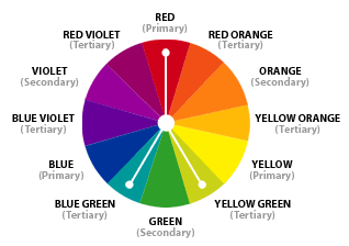
This is the classic split comp which we labeled version 'A' in our notes. One color plus the two colors to either side of it's opposite. It includes (as all schemes do) shades and tints of all included hues. We also allow expanded classic split which we labeled 'B' in our notes. That adds allows you to use both opposites in addition to the adjacent colors, resulting in 4 colors. Lastly you are allowed to use my version labeled 'c' in your notes. That version is two side by side colors and their two side by side opposites, like a narrow 'x'

2. Triadic Color Scheme:


Triadic color scheme is a set of  any 3 equidistant (equally apart) colors


You must also use one unifying color scheme.

1. Analogous


Analagous schemes include 3 consecutive colors on our wheel.

2.  Monochromatic


Monochromatic schemes include only one color/hue and relies on shades and tints of that color to create a palette.

You must also do one poster with a balance system using symmetry (mirror or relative,) and one poster using asymmetry (asymmetrical balance.)

Due Monday the 19th 

Monday, November 14, 2011

Texture/Collage


Texture is how we describe the surface quality of a 2-dimensional design. With physical objects, we experience texture when we touch their roughness, smoothness ect. We call this a tactile experience, which means a sensation experienced through the sense of touch.
In design, particularly collage, we CAN use materials with real tactile surfaces such as cloth or sandpaper. We say these materials have Actual Texture. More frequently though, we are using photography, digital illustration, drawing or other media to simulate the mapping these tactile impressions on to the two-dimensional picture.  Thus materials  or images that have the visual illusion of texture but not the tactile qualities are called Simulated Textures. It  is usually by capturing created the varying pattern of light and dark areas on a surface that this is achieved by either camera or hand.
Collage: From the French, meaning 'pasteup,' An artistic composition of materials and textures pasted over a surface, often with unifying aesthetics or themes. Often this term is also applied to digital compositions featuring the integration and overlapping of multiple visual elements
For our next assignment we are going to be experimenting with actual and simulated texture within the framework of 2 specific, and very different approaches to collage.
COLLAGE TYPE 1: RE-CONTEXT
This approach to collage is where artists cut out entire identifiable images (people/objects/words/environments) from various different sources (contexts) and put them together in a new image (recontextualize.) This is usually done to create an unusual, fragmented, immediate image that refers to the culture around us in addition to the artist's vision.  Good Re-context collages  should be both bold, energetic and have a P.O.V.


COLLAGE TYPE 2: MOSAIC
This approach to collage is where artists 'paint with paper,' that is, they lay out an idea for an image in pencil and then 'color' it by cutting or tearing pieces of paper or other 2-d materials who are chosen for their color of texture. Entire images are not cut out, just a palette made of fragments of paper.


Tuesday, October 4, 2011

Value project

Part ONE

Part 1     8"x 11: graphic/closed value abstraction in your sketchbook
Draw two horizontal lines with two different angles across the bristol paper. Then draw one vertical line. Then draw 2 curving, looping, moving irregular lines that start at the left edge and finish to the right. Then softly in an H pencil draw a little number in each independent shape created by this process. Should yield 18-22. If it yields less than 15 add another line. In each shape one must create a closed value, with a maximum of 3 paper white areas left blank. The goal is to have no two adjacent areas appear to have the same value. It is a good idea to use a darker (6B) pencil for your black and dark grey areas, a 2B pencil for your mid grey tones, and to experiment with the H pencils for your lightest tones.

Part TWO

1 8x11  gradient value abstraction in your sketch book

Draw three vertical lines at various angles across a sheet of 9x12 Bristol. Then draw three horizontal lines at various angles. Finally create a value gradient in each of the resulting geometric shapes. Keep changing/rotating the direction of the gradient so that no single edge has back to back black areas. Can be done completely in 2B pencil.


Inspired by Picasso’s cubist study


Thursday, September 29, 2011

Firehouse Gallery Reaction Paper

2D Design
Professor Michael P. Giacalone
‘Borders: Visible/Invisible’ reaction paper.
Exhibition at the Firehouse Plaza Gallery CCB building on Campus
Answers to be numbered, and typed. Paper to be printed. Due Wednesday Oct 19th

1.      Find a work in the exhibition that uses the density, and intensity of line as an important element. Include the artist and the title of the work. Describe HOW the artists uses line in this way. DESCRIBE what you see. WHAT does using line in this way make you feel or think about in regard to this piece.
2.      Find a work in the exhibition that has organic and geometric shapes competing for dominance (like in our class project.) Include the artist and the title of the work. DESCRIBE the shapes you see, and how they interact.
3.      Find a work in the exhibition in which a range of values from light to dark is important. Include the artist and the title of the work. DESCRIBE how the values are used, and HOW they help bring the image to life.


From the official questionnaire 

4.      The artists in this exhibition considered the concept of Borders, which could range from physical borders to conceptual borders (such as spiritual or political), even to creative, social or technological borders. What “borders” do you confront on a daily basis? Are they positive or negative?
5.       Artists use imagery and colors like authors use words and adjectives- to tell a story or send a message. A symbol is an image that represents an idea. Select an artwork that you feel contains a strong use of symbols, or a symbol that is personal to you. Name the symbol(s) and explain your reasoning, keeping in mind the concept of Borders Visible/Invisible.


Tuesday, September 27, 2011

VALUE: The Art of Light & Dark

VALUE


(noun) - A formal element of art, value refers to the range of lightness or darkness of tone or color within an image. Value becomes critical in a work which has no colors other than black, white and a gray scale. For a great example of value in action, think of a black and white photograph. You can easily visualize how the infinite variations of gray suggest planes and textures.


Gradient Value: This is the approach to using tone or "shading' which utilizes soft, blending, blurring movements from light to dark and vice versa to try to capture the effects of light on subject matter in the physical world. Light and shadow is used to created the illusion of shape, depth and texture as well as environmental illusions of light.

Rembrant Artists Father


Edward Weston


Robert Longo (contemporary)


Now look at the difference in the same subject matter when we switch to Graphic/Closed value, where independent shapes and areas are given distinct non-gradient values edge to edge. This effect creates greater contrast and immediacy, but sacrifices realism. This is the approach to value most frequently scene in graphic design.
Shepard Fairly

In this vintage Polish movie poster, graphic value and chromatic (color) contrast work hand in hand. Remember in every color their is still a value that must be considered.


also here:


 closed/graphic value grey scale


gradient/illusionistic grey scale


Tuesday, September 13, 2011

Assignment 001: Organic & Geometric Shapes Compete For Dominance

All two dimensional shapes break down into two basic categories:

Organic (or curvilinear) and Geometric (or rectilinear)

Organic shapes are typically asymmetrical shapes with an irregular boundary, often flowing or curving, thus they are often also referred to as curvilinear shapes. However, the boundaries or edges can also be jagged or prickly, showing one of various possible influences from the natural world. Examples of organic shapes include the shapes of plants, rocks and animals. Aside from obvious organic forms, designers  often create abstract and unique organic shapes and patterns which may reference nature, but do not precisely resemble any actual natural object or being. 


Examples of Organic Shapes in Art:

Salvador Dali Metamorphosis of Narcissus


Joan Miro, Carnival of Harlequin,

 Peter Max
 

Ryan McGinness


https://s-media-cache-ak0.pinimg.com/236x/ba/23/88/ba238862adca8c567816c646a4b8834e.jpg
Emilio Pucci print


Arcimbolo


Pablo Picasso painting...


Geometric (or Rectilinear Shapes) are mechanical shapes characterized by their ability to be mapped or grid-ed mathematically. Thus they have straight lines, definable angles and arcs, and can be represented by points and equations. Beyond squares, circles and triangles, designers build new and provocative geometric forms by combining and expanding existing shapes into new directions.

Examples of geometric shapes in art and design:


Piet Mondrian


Frank Stella's 'Harran II', 1967


Movie poster, Boris Bilinsky, 1927

Dado panel, first half of 15th century; Mamluk
Egypt
Polychrome marble mosaic


Pucci geometrics


Steve Ditko


So our assignment is to create a 9x12 2D image where you create a visual tension or 'competition' between organic and geometric shapes. This could be expressed 'figuratively,' meaning with recognizable objects and settings (like a werewolf wrestling a geometric robot) or through abstract compositions of shapes, tones and colors.