Wednesday, March 6, 2013

Assignment 002: Moodswing Line Portrait

Line is an essential building block of imagery since the first artists painted in caves. We can define it this way:


Line is most easily defined as a mark that spans a distance between two points (or the path of a moving point), taking any form along the way.

As we learned in class there a various elements of line which a designer can control, among them are:


1. Direction
2. Intensity
3. Density
4.Context
5. Medium


In design we have articulation lines, and expressive lines, and abstract expression lines.


Articulation lines, are lines we use to carefully define the edges and outline and interior details of forms we wish to have a specific appearance. Often these are lines used to render something from observation


DaVinci Skull


Expression Lines  are lines which have an intensity and distinctive mark which bring the individual style vision and vision of the artist into collaboration with what is being articulated.

Vincent van Gogh Starry Night Sketch.

Other times there is no subject matter, and an artist uses only expression lines to create an abstract expression.

Jackson Pollack No. 14


Cy Twombly

We have now created an in-class expressive line vocabulary in our sketchbook for the following emotions or psycological states:
1. Anger/rage
2. Joy/ecstacy
3. Depression
4. Tranquility/Zen
5. Confusion/Anarchy
6. Order/Authority
7. Fear/Anxiety
8. M.P.D.

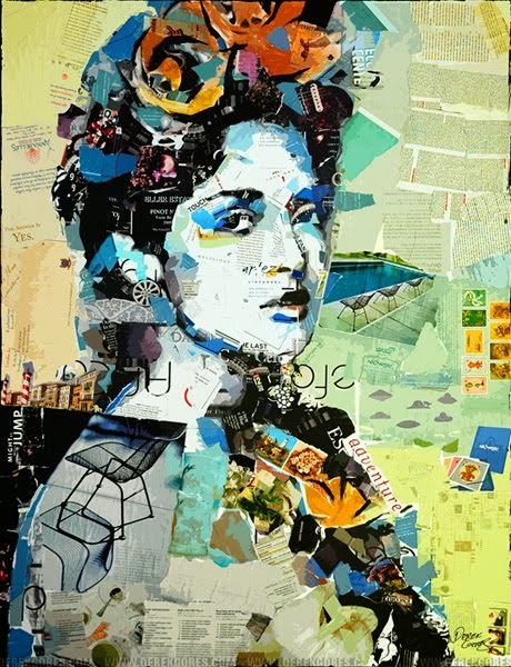
Your assignment is, using pencils or markers to create a 'mood swing portrait' of either yourself, a friend, or a celebrity on one piece of 9x12' bristol. This drawing is to be composed only of expressive lines, and NOT soft areas of shading, blurring or smudging.

Using the line vocabulary we created in class, you are to choose emotions styles to intergrate into the style of your portrait, and 1 emotion style to use for a 1 color abstract background. The background line abstraction can be done in colored pencil or marker.

We should be able to see how the specific styles you created in your emotional line vocabulary have influenced the articulation lines you have used in your portrait. I will ask you to explain where and how you took the style created in your in-class experiment and intergrated it into your portrait.The background is just an abstract pattern of pure expression lines drawn in one accent color.

Below are some examples of the assignment. How you balance articulation vs. expression is up to you, but remember this is a lesson about expression, and I want you to err towards making these electric, abstract and interesting.


Monday, November 12, 2012

Deep/Plastic Space VS. Shallow/Graphic Space

Deep/Plastic Space:

Plastic/Deep refers to the representation of three-dimensionality  that occurs in a flat picture plane. For our purposes it also refers to elements of illusion in 2-D space. Illusion of texture, and gradient value. All the things that come together to capture a sense of the 'reality' of the physical world.


Shallow/Graphic Space:

This is a flat, designer abstraction  of space that substitutes pattern for texture, bold decorative color choices for naturalistic ones, hard edged graphic value for gradient value and essentially transforms space from representing the realism of nature, to expressing the individual potential of design.


Monday, October 22, 2012

sketchbook  

1. create a charachter
2. in 4 windows of any size/dimension tell a small story or show an action
3. Window 1: Mirror sym
4. Window 2: Relative sym
5. Window 3: Asymmetrical with gradient background
6. Mirror sym with in expressive line style

Thumnail version is sketchbbok  final version ion bristol


Sunday, December 11, 2011

The Color/Balance Final

The final project asks that you create 2 original, new designs of a poster for a film of your choice. They must be done in color, can be done in any medium and must be at least 10" x 14"

You must do one poster using a varying color scheme. These include:


1. Split Complementary Scheme:


This is the classic split comp which we labeled version 'A' in our notes. One color plus the two colors to either side of it's opposite. It includes (as all schemes do) shades and tints of all included hues. We also allow expanded classic split which we labeled 'B' in our notes. That adds allows you to use both opposites in addition to the adjacent colors, resulting in 4 colors. Lastly you are allowed to use my version labeled 'c' in your notes. That version is two side by side colors and their two side by side opposites, like a narrow 'x'

2. Triadic Color Scheme:


Triadic color scheme is a set of  any 3 equidistant (equally apart) colors


You must also use one unifying color scheme.

1. Analogous


Analagous schemes include 3 consecutive colors on our wheel.

2.  Monochromatic


Monochromatic schemes include only one color/hue and relies on shades and tints of that color to create a palette.

You must also do one poster with a balance system using symmetry (mirror or relative,) and one poster using asymmetry (asymmetrical balance.)

Due Monday the 19th 

Monday, November 14, 2011

Texture/Collage


Texture is how we describe the surface quality of a 2-dimensional design. With physical objects, we experience texture when we touch their roughness, smoothness ect. We call this a tactile experience, which means a sensation experienced through the sense of touch.
In design, particularly collage, we CAN use materials with real tactile surfaces such as cloth or sandpaper. We say these materials have Actual Texture. More frequently though, we are using photography, digital illustration, drawing or other media to simulate the mapping these tactile impressions on to the two-dimensional picture.  Thus materials  or images that have the visual illusion of texture but not the tactile qualities are called Simulated Textures. It  is usually by capturing created the varying pattern of light and dark areas on a surface that this is achieved by either camera or hand.
Collage: From the French, meaning 'pasteup,' An artistic composition of materials and textures pasted over a surface, often with unifying aesthetics or themes. Often this term is also applied to digital compositions featuring the integration and overlapping of multiple visual elements
For our next assignment we are going to be experimenting with actual and simulated texture within the framework of 2 specific, and very different approaches to collage.
COLLAGE TYPE 1: RE-CONTEXT
This approach to collage is where artists cut out entire identifiable images (people/objects/words/environments) from various different sources (contexts) and put them together in a new image (recontextualize.) This is usually done to create an unusual, fragmented, immediate image that refers to the culture around us in addition to the artist's vision.  Good Re-context collages  should be both bold, energetic and have a P.O.V.


COLLAGE TYPE 2: MOSAIC
This approach to collage is where artists 'paint with paper,' that is, they lay out an idea for an image in pencil and then 'color' it by cutting or tearing pieces of paper or other 2-d materials who are chosen for their color of texture. Entire images are not cut out, just a palette made of fragments of paper.


Tuesday, October 4, 2011

Value project

Part ONE

Part 1     8"x 11: graphic/closed value abstraction in your sketchbook
Draw two horizontal lines with two different angles across the bristol paper. Then draw one vertical line. Then draw 2 curving, looping, moving irregular lines that start at the left edge and finish to the right. Then softly in an H pencil draw a little number in each independent shape created by this process. Should yield 18-22. If it yields less than 15 add another line. In each shape one must create a closed value, with a maximum of 3 paper white areas left blank. The goal is to have no two adjacent areas appear to have the same value. It is a good idea to use a darker (6B) pencil for your black and dark grey areas, a 2B pencil for your mid grey tones, and to experiment with the H pencils for your lightest tones.

Part TWO

1 8x11  gradient value abstraction in your sketch book

Draw three vertical lines at various angles across a sheet of 9x12 Bristol. Then draw three horizontal lines at various angles. Finally create a value gradient in each of the resulting geometric shapes. Keep changing/rotating the direction of the gradient so that no single edge has back to back black areas. Can be done completely in 2B pencil.


Inspired by Picasso’s cubist study